One of the most important factors in accessory design is color. Before a person even sees the shape, construction, or smaller elements of a bag, piece of jewelry, shoe, or accessory, the color of the product can convey a lot about the feeling and message of the piece. For designers, picking color is a choice based not just on a designer’s own preferences, but also on the role that color plays in establishing the character of the accessory and determining if the design will fit well into the wearer’s wardrobe.
Color plays an important role in accessory design because accessories tend to be more visually impactful than clothing. A good choice of color can make an accessory stand out from its outfit, whether it looks sleek, vibrant, fun, or elegant. Color also communicates a lot about the product. A muted palette could suggest timelessness and flexibility, while bright colors could imply boldness and individuality. Being aware of these associations can help designers choose colors that support the purpose of the design rather than picking them arbitrarily because they are nice on their own.
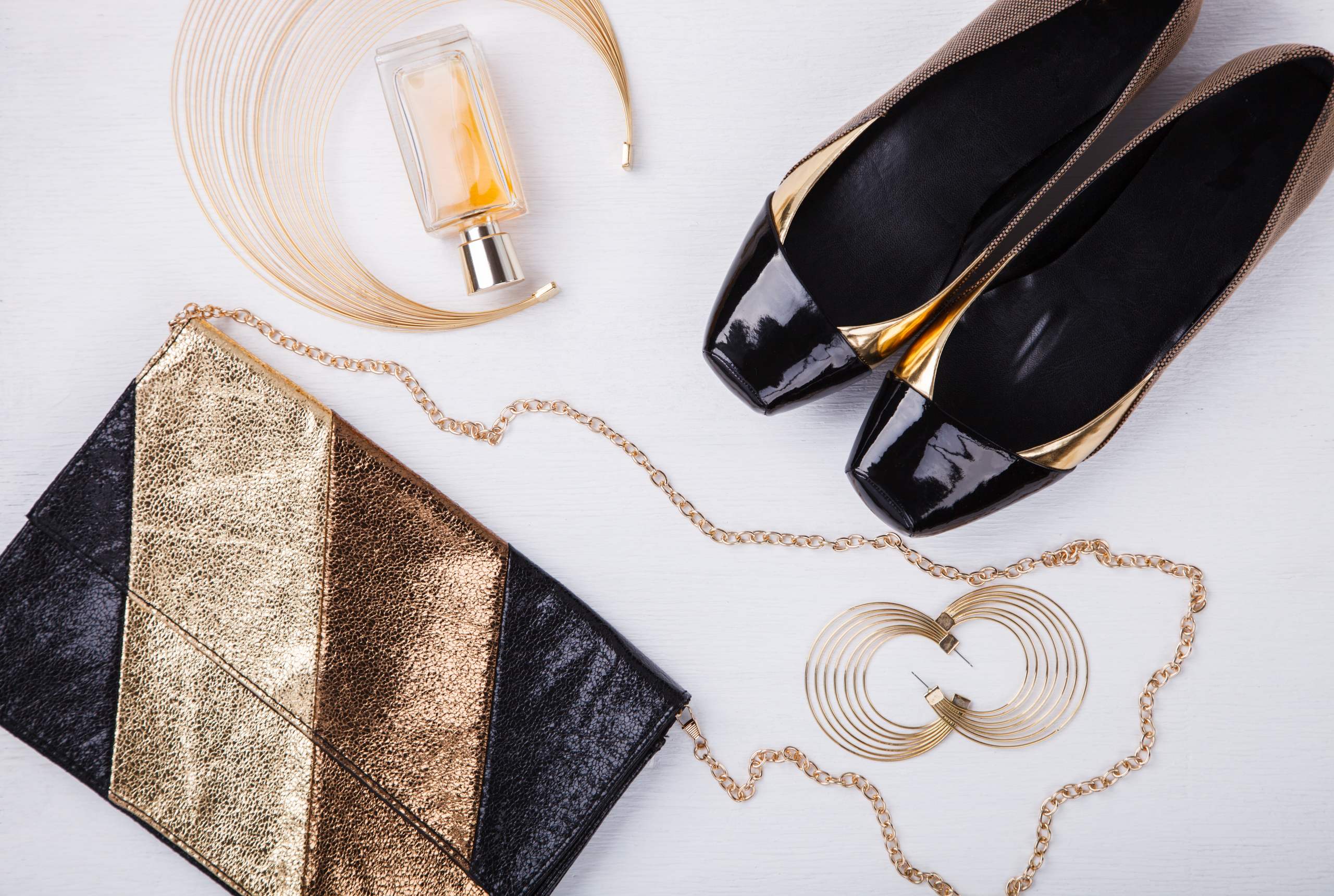
The way that colors interact with each other is an essential concept to understand when choosing colors for a design. Using colors in complementary, analogous, monochromatic, or contrasting combinations can achieve different results. For example, a monochromatic color scheme can make an accessory look sophisticated and unified. On the other hand, contrasting colors can be used to accentuate details like hardware, stitching, print, or embellishments. A designer doesn’t necessarily need to use a variety of colors. Sometimes a simple palette can result in a strong design.
Color can also play an important role in defining the visual identity of an accessory brand. If a brand consistently uses a certain palette across its designs, customers will begin to associate that palette with the brand. When choosing colors for a new collection of accessories, it is important for designers to think about how the colors work together and how they relate to the identity of the brand. The color palette should feel cohesive not only within the design itself, but also within the larger collection.
It is important to keep in mind who the accessory is meant for when picking colors. A designer must take into account the preferences of the target customer, including their lifestyle, culture, age, taste, and purchasing habits. This means that the designer should do some research to figure out which colors will appeal to the customer. While trend forecasting can offer helpful ideas, there should be a reason why a particular color is being chosen.
Color can also be used to establish a visual hierarchy in a design. If a designer wants to highlight a detail, such as a clasp, strap, logo, or stone, he or she can use a contrasting color to draw attention to it. This strategy can be especially useful when there are many details in an accessory design. The designer can use color to emphasize the key details and make the overall design more understandable.
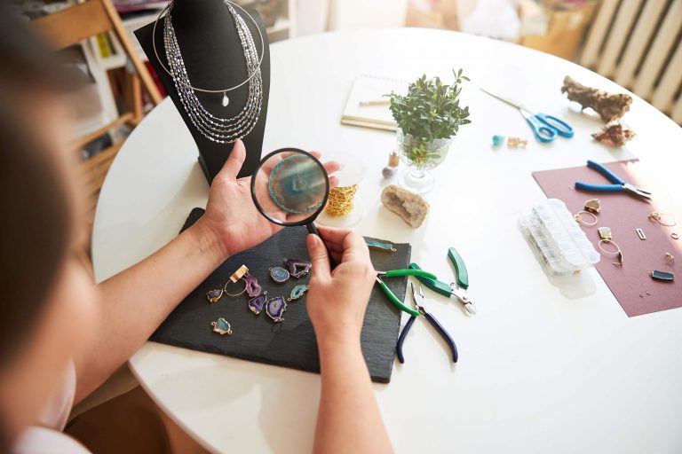
The design process usually starts with gathering color references from various sources like architecture, nature, art, photography, interiors, fashion, and other surroundings. These references can be assembled into a mood board and then narrowed down into a palette. Once the designer has selected a palette, they should test the colors on the accessory to make sure that they work together. A color that looks great on a screen or mood board may not translate well onto the accessory, whether due to the material, texture, finish, size, or another factor. To make sure that the colors work, designers should create physical samples to see how the colors look in practice and refine the palette if necessary.
Trends can inspire designers, but they can also become outdated quickly. Finding a balance between current trends and timeless design is important. The designer can include popular colors that appeal to the audience, but also incorporate neutral colors that have enduring appeal. Alternatively, they can add a few unexpected pops of color to create a fresh look while still incorporating basic colors.
Color is an important element in accessory design. It defines the brand and the product, highlights the important details, and influences how a customer will experience the product. By learning how to combine colors, researching the customer base, experimenting with color palettes, and testing colors on the product, designers can use color to strengthen the character and identity of their designs. As students continue to develop their skills in accessory design, a deep understanding of color will help them create accessories that are not only aesthetically pleasing, but also effective and relevant to their audience.